Learn how to harness the power of color theory to turn your home into a stunning work of art!
Have you ever wondered if there’s a science behind creating visually appealing spaces?
In this blog, we will explore how you can use color theory to design your dream space and the psychology behind how colors can affect your mood and set the overall atmosphere of a room. Lets get started by finding out what color theory is!

What is Color Theory?
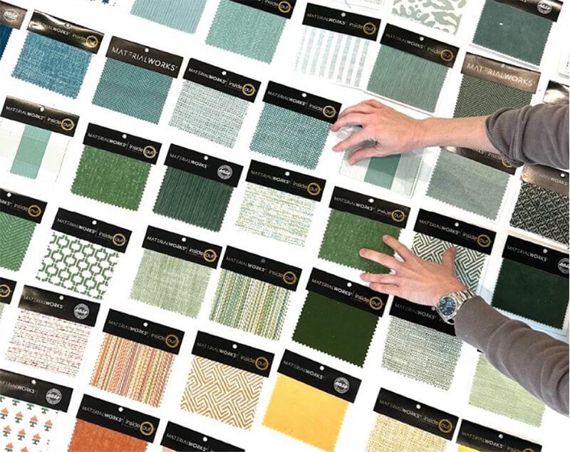
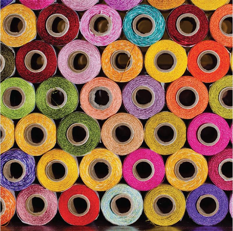
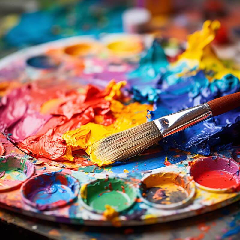
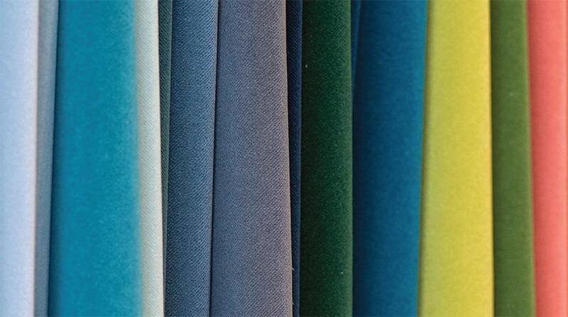
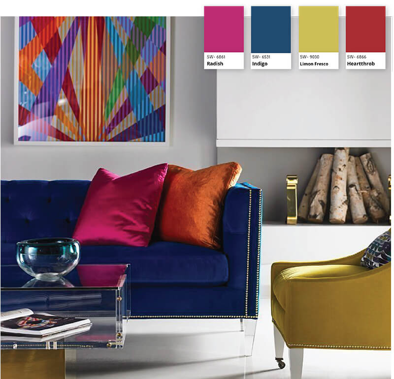
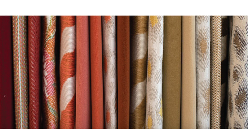
Color theory is both the science and art of using color. It’s the collection of rules and guildlines which designers use to communicate with consumers through appealing color schemes in visual interfaces. Color schemes act as a guildline for picking materials and colors in a space and can dictate the overall design direction of a room. Schemes can begin with an inspirational message, a piece of fabric, a paint swatch, or a color that you've simply wanted to have in your home. Color in home design can set the tone of an environment and enhance the overall aesthethic appeal.
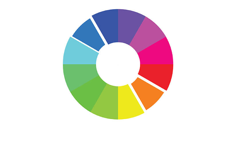
The Color Wheel
The color wheel is an illustrative tool used to help us define colors and their relationship to one another. We can use the power of color harmony to design spaces that truly reflect our desired atmosphere.
Complimentary colors
Complimentary colors sit directly across from each other on the color wheel. Each color has exactly one, highly contrasting, complimentary color. These are generally employed as accent colors.
Theodore Alexander: Alexa Hampton- Wingate Sofa-SKU# U1059-96 | Miguel Cocktail Table - SKU#AXH51009C105
Analogous colors
Analogous colors sit directly to the left and right of a color on the wheel. These are harmonious colors and are ideal for monochromatic color schemes.

Triadic color wheel
Triadic colors form a triangle on the color wheel. You find them spaced equally in thirds around the wheel. These high-contrast schemes will make for a personality-filled space.
Lilian August: Wright Modern Sofa-SKU# LA6154S
Why Does All This Matter?
An extremely important concept for interior designers to understand is that of warm and cool colors. This is defined by the color’s undertones. Warm colors will have red undertones, and cool have blue undertones.
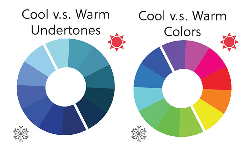
Warm and cool undertones are what gives different shades of the same color a different feel. A cool blue can be more crisp and clean while a warm blue may be more lively. Certain materials will have inherent warm or cool undertones which is also important to note when designing your space. Undertones should heavily influence most of the decisions you make during the interior design process. While color matching isn’t always necessary, maintaining consistent undertones can ensure a cohesive and harmonious space.
Psychology behind colors
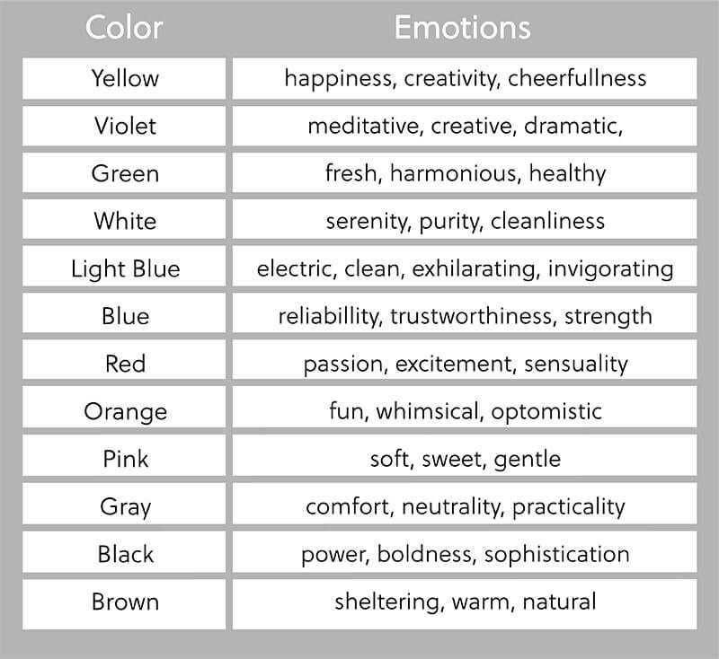
Color psychology refers to how different colors can affect human mood and behavior. Unconscious or otherwise, color can evoke emotions, inspire reactions, and change modes of thinking. Color is strategically used in marketing for major brands because it evokes emotion and reaction in humans. For example, red colors stimulate appetite and can be found on the logos of major brands such as Coca-Cola and Frito-Lay. So yes, choosing between yellow and green paint in your kitchen can impact the overall mood and vibe you desire to create. Now, let’s delve into the realm of emotions that each color evokes and discover the optimal spaces to incorporate these colors into your home decor.
Orange
Orange exudes a sense of fun, whimsy, optimism, self-assurance, persuasion, and liveliness. It is ideal for spaces such as the sitting room, living room, kid’s room, or playroom.
Lexington & Tommy Bahama Home: Covina Chair-SKU#1896-11
Violet
Violet fosters a meditative, sensual, thrilling, creative, dramatic, and expressive atmosphere. It’s best used in spaces such as the guest bedroom, playroom, or studio space.
Century: Illusion Desk- SKU# I39-762
Green
Use green if you want fresh, renewing, restorative, harmonious, or healthy vibes. The best place to use green is in the kitchen, kids’ room, or family room.
Chaddock: Dawson Side Chair- SKU#Z-940-26
White
White embodies qualities of innocence, silence, calmness, airiness, lightness, serenity, purity, and cleanliness. It is a versatile choice that works well in spaces like the entryway, kitchen, and laundry room.
Theodore Alexander: Lucienne Chest of Drawers- Theodore Alexander- SKU#6002-247 | After Hours Bed- Caricole
Light Blue
Light blue has the power to create an electric, clean, exhilarating, or invigorating atmosphere. It is a perfect choice for spaces where you seek to evoke a sense of cleanliness, such as the kitchen, guest bathroom, or laundry room.
Made Goods: Gene Mirror- SKU#MIRGENE2838AB
Red
Red embodies qualities of passion, excitement, stimulation, sensuality, electricity, provocation, and energy. It is best utilized in spaces like the dining room, guest bathroom, and bedroom.
Theodore Alexander: Althorp Living History South Drawing Room Occasional Table- SKUAL50195
Blue
Blue embodies qualities of reliability, trustworthiness, introspection, strength, and clarity. It is most effectively utilized in spaces like the home office, family room, dining room, master bathroom, or mudroom.
Lillian August: Thanos Armless Chair- SKU# LA3107AC | Valnoir Server - SKU# LA23051
Yellow
Yellow evokes feelings of happiness, creativity, cheerfulness, self-confidence, friendliness, and warmth. It’s a wonderful choice for spaces that guests and family members frequent often, such as the kitchen, powder room, guest bath, or dining room.
Lillian August: Armand Banquette SKU#LA5122AL | Oscar Stools - SKU#LA8105B
Pink
Pink creates a soft, subtle, sweet, innocent, cozy, gentle, and composed atmosphere. It is well-suited for spaces such as the sitting room, kid’s room, or guest bathroom.
Lilian August: Josephine Daybed-SKU# SHL-LA7162D
Gray
Gray represents qualities of comfort, neutrality, quietness, and practicality. It’s an excellent option for a variety of spaces, including the family room, dining room, bedroom, home office, master bedroom, and hallways.
Century: Stevie Side Chair-SKU#CCC3127S
Black
Black exudes power, sophistication, boldness, classic elegance, modernity, and an air of mystery. It can be used in the powder room or as accents to add a touch of sophistication.
Four Hands: Brylee Sectional- SKU#236302-002
Brown
Brown creates a sheltering, warm, natural, secure, reliable, and supportive ambiance. It complements spaces such as the family room, home office, basement, kitchen, and hallways, enhancing the desired atmosphere and characteristics.
Hooker Furniture: Charleston Console Table-SKU# 6750-80161-85
How can color affect the home?
Color has the unique ability to evoke emotions in humans and set the tone and ambiance of a room. We discussed what feelings and emotions different colors can provoke, now let’s take a look into how colors can affect different rooms in your home.
Bathroom
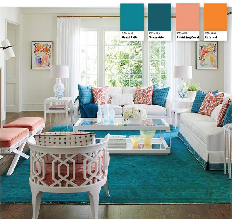
Whether your bathroom is big or small, you can make it feel like a spa by incorporating teal or turquoise. These colors possess the remarkable ability to soothe our mood, drawing upon the calming qualities of both blue and green, leaving us feeling peaceful and rejuvenated. They effortlessly create an atmosphere of tranquility and vitality, simultaneously relaxing and refreshing our senses. While pastel shades of teal and turquoise are commonly found in bathrooms and spas, bolder colors are also becoming a trend. Don’t be afraid to use a rich or bold teal in your bathroom.
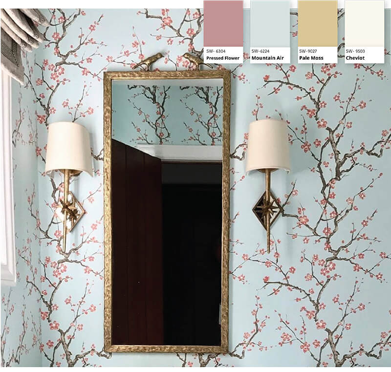
Madegoods: Joelle Mirror with Polished Brass Finish- SKU#mirjoelle1738ap1bz | Quadrille Fabrics- Cherry Branch Wallpaper-SKU#306500W-06WP
Master Bedroom
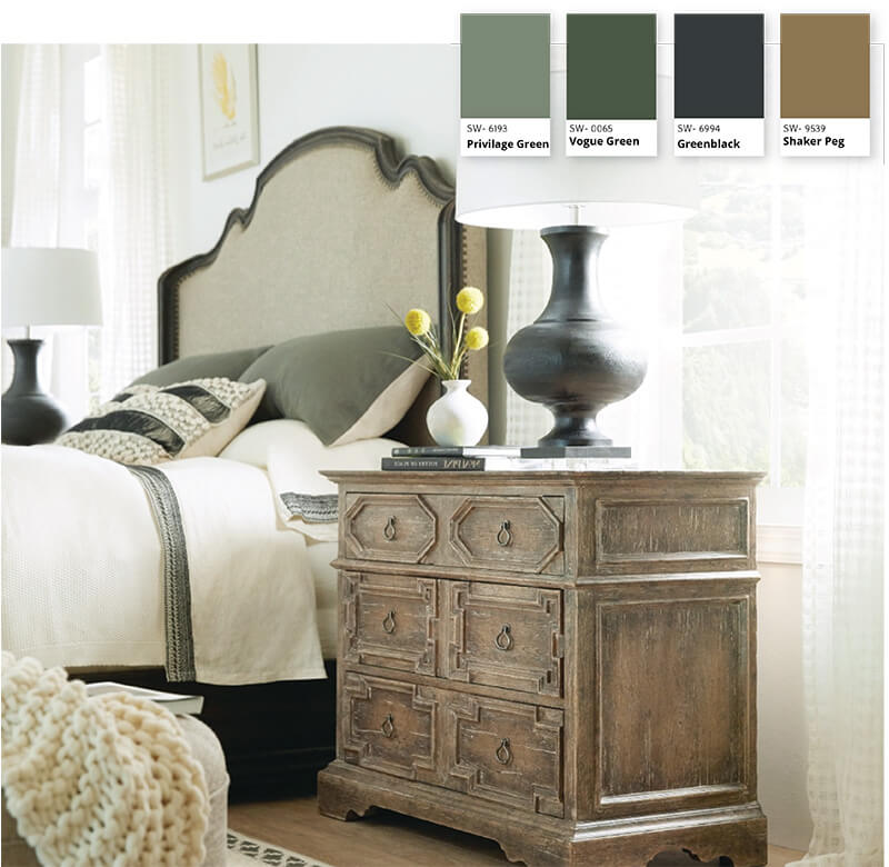
Among all the rooms in a house, the master bedroom should exude the most tranquility and calmness. You need to create a space where you can have downtime that eliminates the stress from your day and leaves you feeling brand new in the morning. The best way to do this is by utilizing green, which promotes feelings of safety, relaxation, and revitalization. As an earthy color, green possesses grounding qualities. To further enhance this effect, incorporate wood elements in your decor. Wooden furniture, decor, or even an unfinished shiplap accent wall will pair well with green. If painting an entire room with a deep green isn’t your style, you can incorporate it into your bedroom in subtler ways. Try keeping live greenery in your bedroom. Potted plants do well indoors, particularly cacti or succulents. Crawling ivy can look gorgeous hanging from a high shelf. Larger plants like a potted Ficus tree grow tall enough to make a statement without taking up too much space.
Living Room
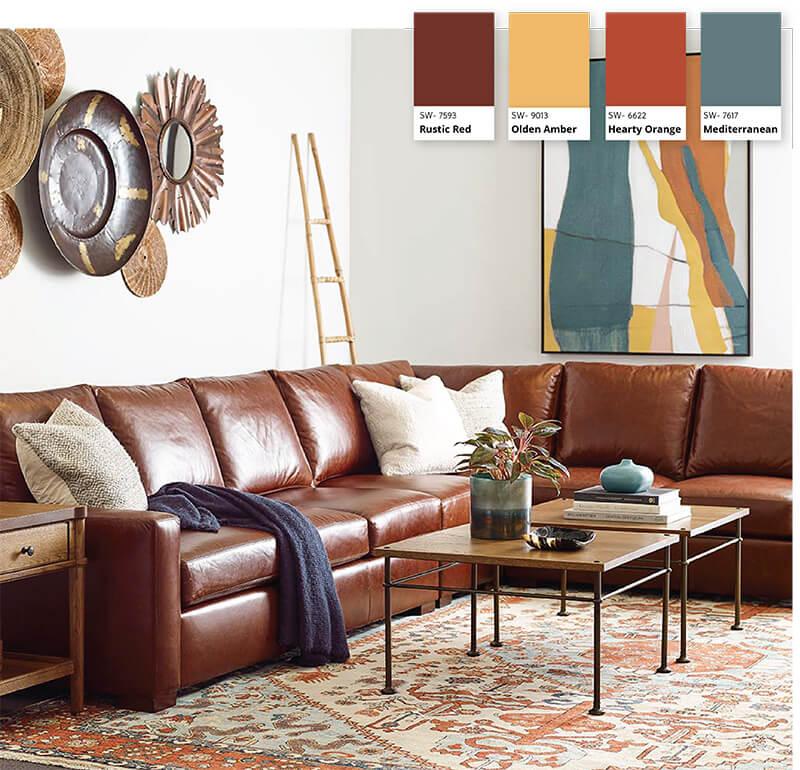
Brown exudes a soft and warm aura, creating a soothing and inviting atmosphere in living rooms. In color psychology, brown symbolizes reliability and safety and is a great choice for a space where family and guests gather. Brown tones work effortlessly in all shades. Lighter browns serve as versatile neutrals, seamlessly blending with any decor style and suiting various personalities. On the other hand, darker browns convey a more modern feel, evoking a sense of comfort and coziness within the room. Incorporating brown into your living room can be as simple as adding a brown leather sofa. Alternatively, you can utilize a monotone color scheme, allowing for seasonal changes with statement pieces. Throw pillows and abstract art can bring the room together, injecting visual interest without appearing dull. If you have an open floor plan, incorporating a large rug can define the living room space and enable smooth transitions to other color schemes in adjacent areas.
Stickley: Memphis Sofa- SKU#96-9470-81-L-FAB-LFS
Materialworks- Windsor Velvet on chair, Designed by @lindseygilleyinteriors, photo by @ClaireZurek
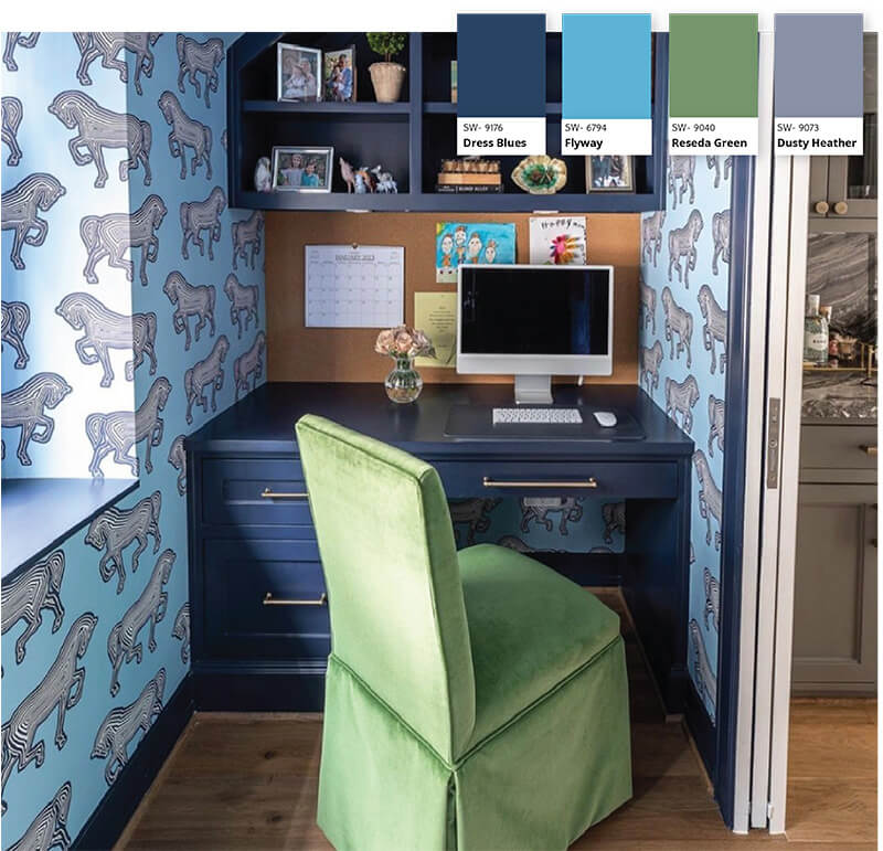
Office
An office setting should feel productive, focused, and relaxed. You can accomplish this by incorporating dark blue into your work area. Similar to how light blue induces relaxation, dark blue also has a calming effect. Unlike light blue, dark blue symbolizes order, responsibility, and security. This makes it an ideal color choice for a home office. According to color psychology, we can influence our minds to become more productive and organized by painting this space in a shade of navy blue. Dark blue can work in any sized room. To help keep the dark color from overtaking your room, mix it with lighter colors like white or cream. Mixing in textures like soft blankets or wooden accents also helps keep the room from looking cold and impersonal.
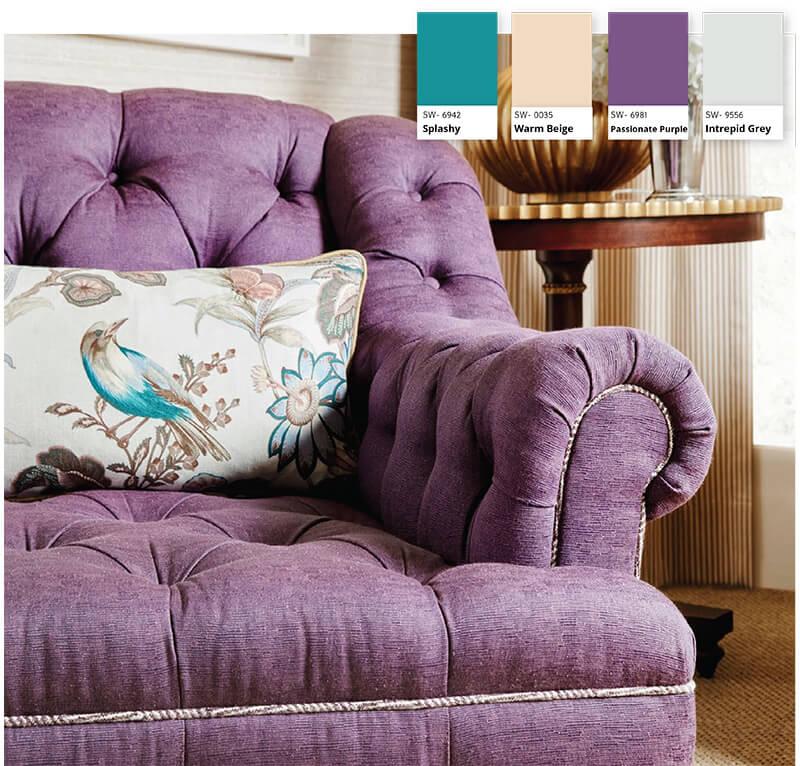
Guest Bedroom
Creating a charming and comfortable atmosphere for your guests is essential in the guest bedroom. Since it’s not frequently used, you have the freedom to get whimsical or adventurous (or both!) with your design choices. Embrace the use of purple in this room to add a touch of enchantment and create a memorable experience for your guests. Unlike teals, shades do matter when it comes to purple. A deep and rich purple is often associated with royalty. Softer shades, however, bring to mind relaxation and coziness. Like with any room of your home, mixing colors with neutral tones helps to balance the space.
Theodore Alexander: Alexa Hampton- Wingate Club Chair- SKU#U3059-40
Theodore Alexander: Jackson Armchair- SKU# AXH40008COM
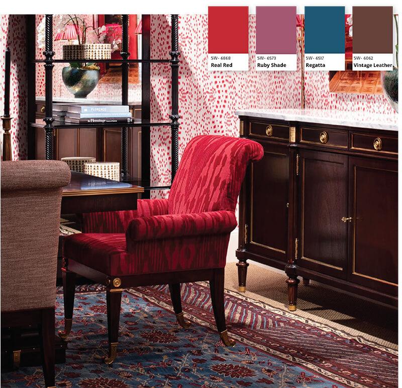
Dining Room
Dining rooms aren’t just for eating. They’re hubs of conversation and laughter. Some rooms are more formal than others, but all dining rooms can benefit from the color red. Red is perfect for dining rooms because it stimulates both conversation and our hunger. The psychology behind the color red is that it raises our energy levels, our appetites, and our metabolism. Restaurants frequently incorporate the color red due to its remarkable ability to stimulate our appetite and cravings. There’s no such thing as a subtle red. However, it can be employed in various ways, ranging from bold statements to subtle accents, to amplify the dining room’s overall aesthetic impact.
In Conclusion
Understanding color theory and the psychology behind colors can greatly impact the design and atmosphere of your home. By incorporating the right colors in each room, you can evoke specific emotions and create spaces that are not only visually appealing but also cater to the desired mood and purpose of the room. From the soothing and rejuvenating effects of teal and turquoise in the bathroom to the calming and grounding qualities of green in the master bedroom, color plays a significant role in shaping the ambiance of each space. Brown brings warmth and livability to living rooms, while dark blue promotes productivity and organization in home offices. Purple adds charm and comfort to guest bedrooms, while red stimulates conversation and appetite in dining rooms. By understanding how colors affect us, we can design spaces that truly reflect our desired atmosphere and create an environment where we feel both comfortable and inspired. So, don’t be afraid to embrace the power of color and create your dream space with confidence and intention.